
Why do we find one place appealing and are uneasy in another? Why are we attracted to one product over another? Colour, whether architectural or in products, accounts for 60 percent of our response to an object or a place. The "buzz" about colour is usually called "colour psychology." But the effects of colour are subtle and significant; physical and psychological. Colour use is not something that results in a definitive equation between "colour and our moods," as is a currently popular expression. Wherever we go we respond to colour, but the importance of colour is often underestimated. Colour use is important to us personally in our homes and in the places where we work.
START SMALL
If you're not sure where to begin with colour, experiment in a powder room or bathroom, a small hall or area between rooms, or an accent wall. If you're doing your own painting, pick an area that's quick to do so you can see your results sooner, and be happy with it or change it. Look at the process as an adventure. To get started, select a favourite colour drawn from artwork, a rug, dishes and an accessory or furniture piece as a main colour or accent.
THINK ABOUT YOUR MOOD
When selecting a colour, consider the mood of a room. In a bedroom do you want the feeling to be restful and soothing or dramatic and intimate? Soft, cool colours and neutrals usually create a quieter feeling while stronger colours are for drama.
Do you want a dining area to feel sociable and stimulating or appear formal and quiet? Warmer, contrasting and somewhat brighter colors add to a sociable atmosphere; deeper blue-greens and neutrals will give a more formal ambiance. Do you want kid's rooms to create an active and exciting energy or an orderly and restful feeling? Be careful not to overstimulate your children with intensely bright hues. You may not know it, but some brighter colours can lead to unrest and irritability. 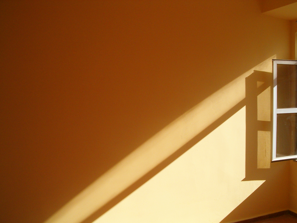
PAY ATTENTION TO LIGHTING
The reason why paint stores have light boxes for you to test paint chips:
So, a strong colour might be too bright and overpowering when used on all walls or next to a large window, but it might be effective when used as an accent wall with indirect light.
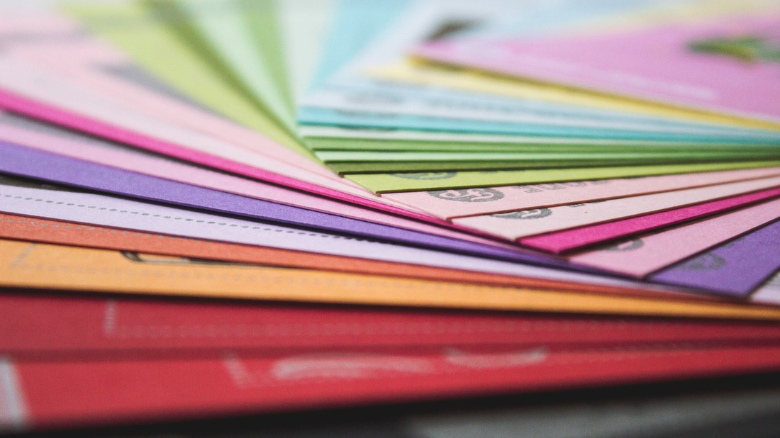
LEARN THE COLOUR TERMS
It helps to understand the terminology used to describe colour.
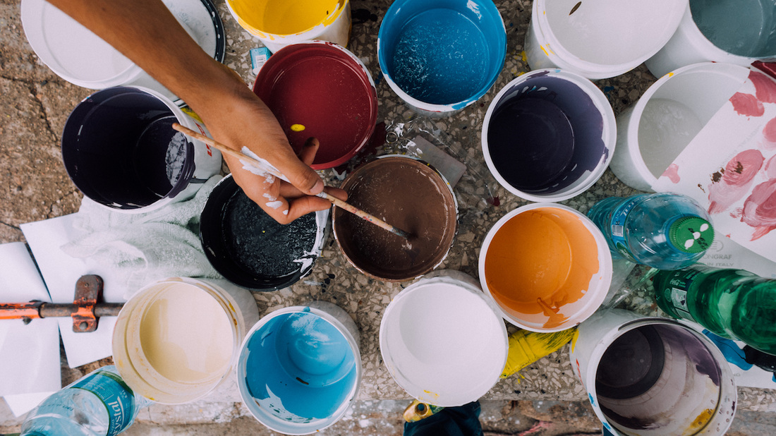
TEST YOUR COLOUR CHOICE
Boost your confidence by testing colours on poster board or large areas of a wall. Don't be afraid to go beyond your comfort zone: Consider strong, vivid colours or soft, deep neutrals like chocolate brown or olive green as main or accent colours. Or add drama with a stronger colour on the ceiling. Tinted ceilings can dramatically change the whole look of a room.
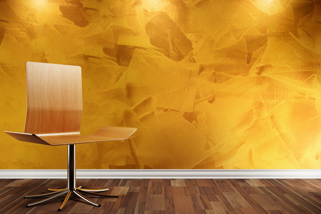
ADD DEPTH WITH DECORATIVE FINISHES
Transform flat, dull walls into interesting and personal spaces with subtle or dramatic visual texture and broken colour. Burnished mineral/metal finishes and layered coloured glazes add depth. Some examples of softly reflective metals are mica, copper, pewter, bronze and, of course, antiqued silver and gold.
WALK INTO ANOTHER ROOM
Consider walls as planes of colour, and see how they interact when viewing one next to the other in adjacent rooms. Approach it like a composition: You're in one room, but you're going to see a piece of another room through it. So as you're choosing colours, consider how they will flow from room to room to create your picture.
FOLLOW THE COLOUR WHEEL
A small colour wheel is a great reference tool for modifying and intensifying two or more colours. For example, red and green, which are complementary (opposite) colours, are most intense when used together. You may be surprised at how many combinations function beautifully together, and you may even become attracted to entirely new colour palettes. The colour wheel also illustrates the visual temperature of a colour. Draw a line from the yellow-green mark on the colour wheel all the way down to the red-violet; you'll see that all the colours on the left are warm and the colours on the right are cool.
Tech To HELP YOU WITH COLOUR SELECTION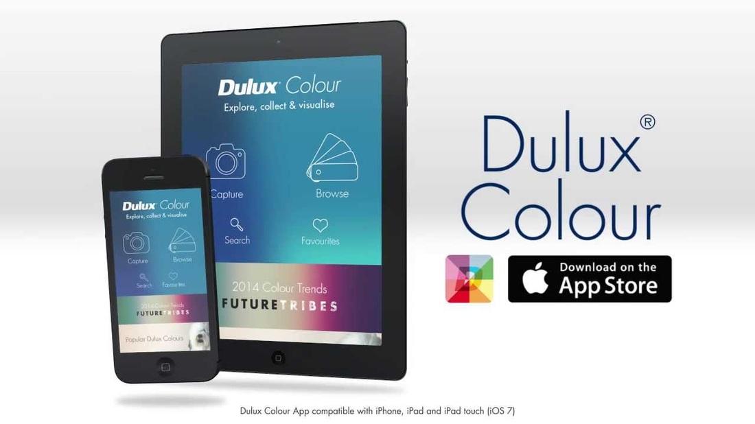
2 Comments
30/9/2016 18:41:07
Thanks for sharing such a wonderful post, as this is very helpful for the selection of colours. 9/3/2022 23:47:45
In conclusion, if you are looking for high-quality, professional painting services, be sure to get in touch with a reputable painting company. It's important to get all the information you need about painting services before selecting a company. By taking the time to research, you can be sure you're making the best decision for your home and your wallet. Leave a Reply. |


AuthorMatthew Johnson Archives
January 2017
Categories
All

|
 RSS Feed
CLICK HERE FOR A FREE NO OBLIGATION QUOTE
HOME | ABOUT | SERVICES | OUR WORK | FREE QUOTE | MASTER PAINTERS AUSTRALIA| NEWS | CONTACT | PRIVACY

|
|
|
|

|

|
Site By www.3996marketing.com